I used to get so angry at JK Rowling when she would take too long to release the next “Harry Potter” book. I have some new respect for her.
In January, I left my dear readers with a cliffhanger — which blue did we choose for our newly renovated kitchen? Yum, yeah. That would be January 2011. OOPS!
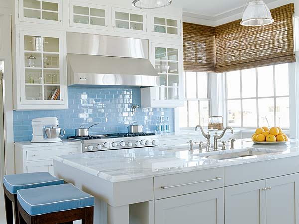
I kept meaning to do a follow-up post, but then I either kept forgetting or kept putting off it off because I knew it required me to take pictures of my kitchen (when it was actually clean). A funny thing keeps happening though. Day after day, one of my top search terms to the site is “beach kitchen.” And then I always feel so bad for those Googlers because I too once spent hours searching for inspiration. And all I’ve left them with is this, my original inspiration photo.
It’s probably a good thing I put it off. Pinterest didn’t exist a year ago when I first meant to post this. So, you’ll forgive me if I, for just this post, litter it with “Pin It” buttons.
So, let’s get this beach party started.
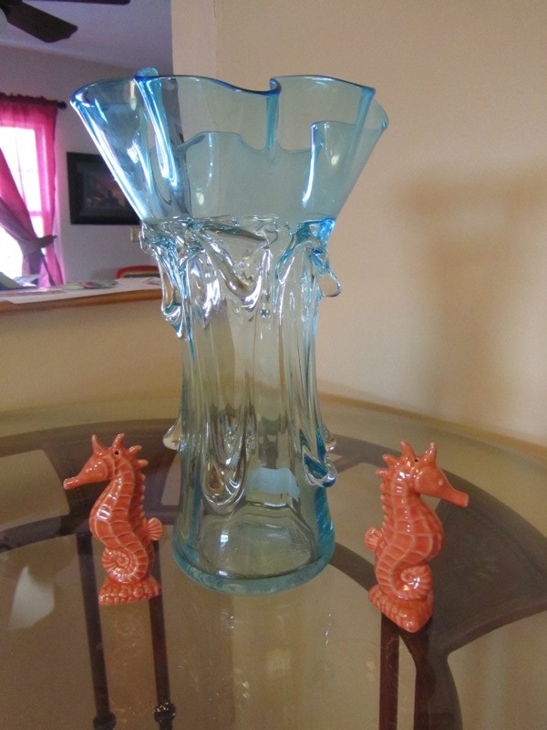
First, here’s what started my beach kitchen dreams:
I bought the vase and seahorse salt-and-pepper shakers in Anna Marie Island a couple summers ago and knew this was the color scheme I wanted for my new kitchen.
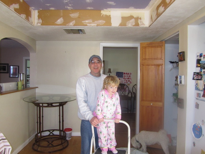
Before we could make it pretty, we had some work to do first. Over Christmas break 2010, my stepdad-to-be, the world famous Dee Dee, tore out our horrendous fluorescent ceiling lights, which were covered with lovely textured plastic ceiling squares, and raised the ceiling, drywalled it and added a beautiful new fixture (and dimmers!).
You can read more about that fun project here.
After Dee Dee and my mom left in January, we started trying to decide on wall colors. That was neither a fun nor fast process. My husband kept claiming every blue I picked was “UNC blue” and clearly that wasn’t going to cut it. Again, you can see all our color samples and deliberations here.
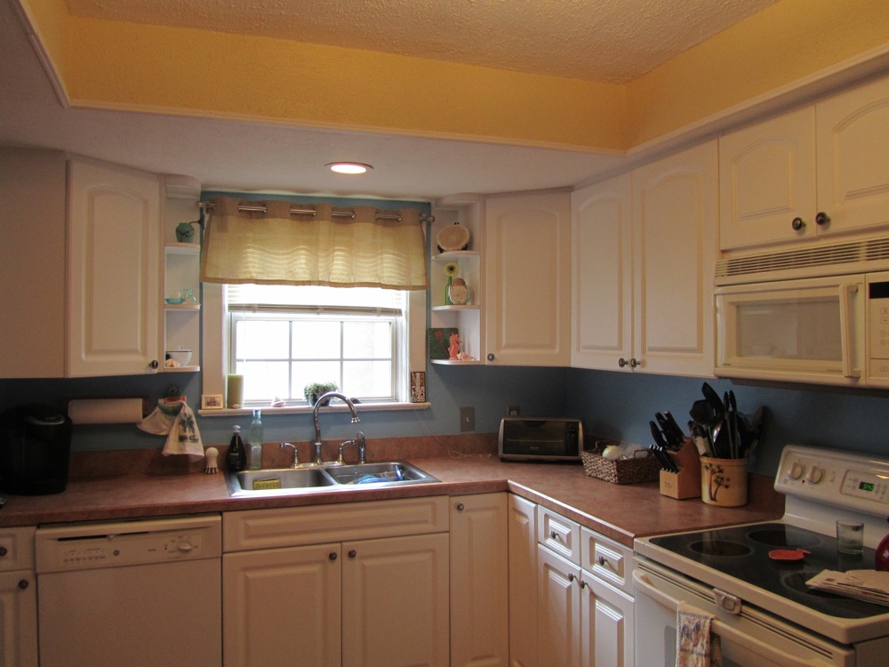
Finally, we picked Behr’s Horizon Haze for the walls and Applesauce for the raised ceiling. After the hard part — painting, ugh — it was time for the fun part — decorating!
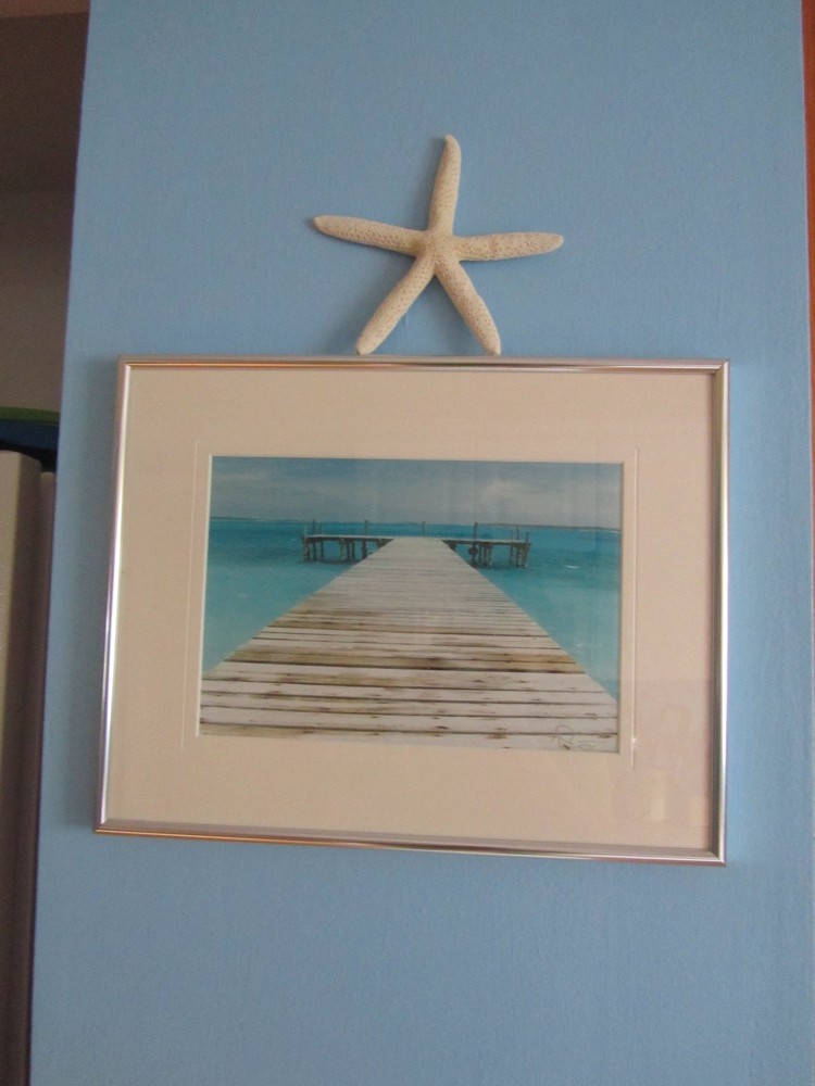
I admit it, for the first month or so after we painted the walls, I HATED the blue. I actually came really close to repainting it. It just seemed to be so far off from the vase that was the original inspiration point. But then I found a picture that we’d had for years tucked away into a cabinet. We never could decide where to hang it. Suddenly, the blue seemed to be the perfect compliment to the vase.
For once, the paint color namers nailed it. Our blue wall was nearly the exact same color as the horizon in that picture, and the beautiful Caribbean sea is the same color as the vase. Bingo!
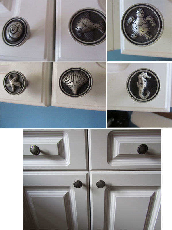
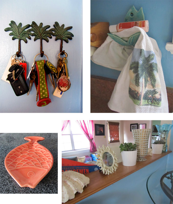
One of the first things I looked for was new hardware. I wanted something beachy that wasn’t too kitschy. Enter coolknobsandpulls.com. I found the PERFECT ones.
How cute are they? For the bottom cabinets and the pantry doors, I chose ridged pewter ones. I thought too many sea creatures might be overkill.
For the window, I used my inspiration photo, which had the burlap-colored curtain. I never would have thought of that but loved it.
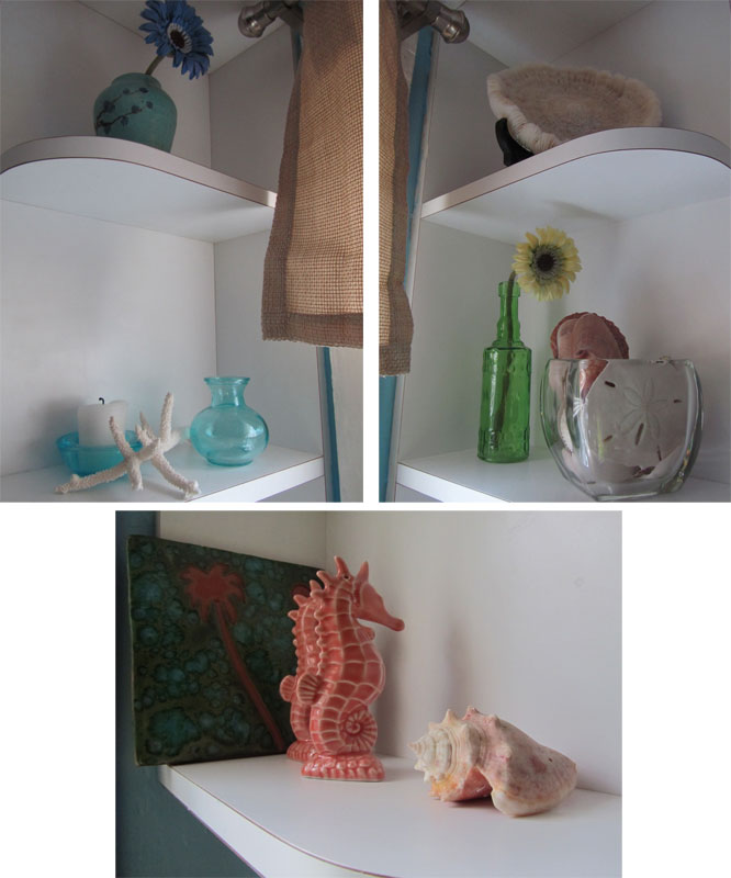
For the shelves around the sink, I added some things we already had, like seashells from our trips to the beach and a small vase I’d recently bought at an art show, and I picked up a couple more small vases (at Hobby Lobby I think) and my grandmother graciously contributed the coral. My grandparents used to live in the South Pacific, where they were missionaries, and the coral often washed ashore on Palau, the small island they lived on (so, don’t accuse us of being coral poachers!).
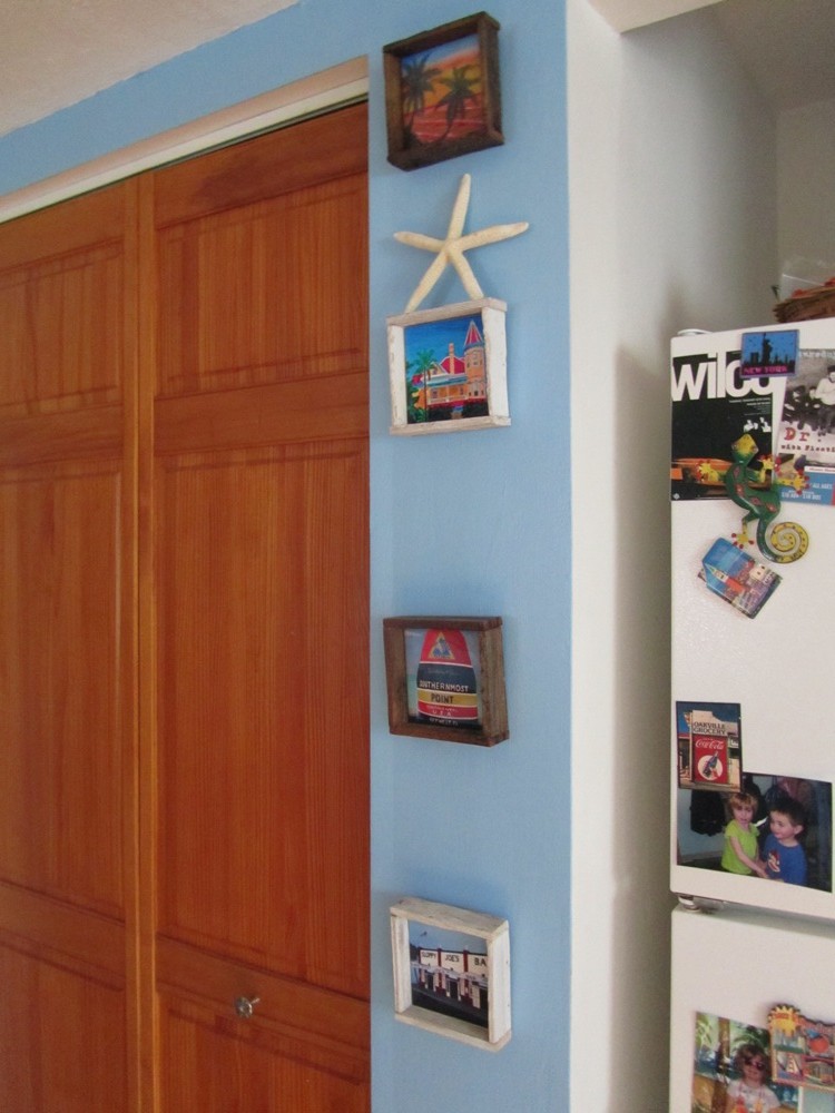
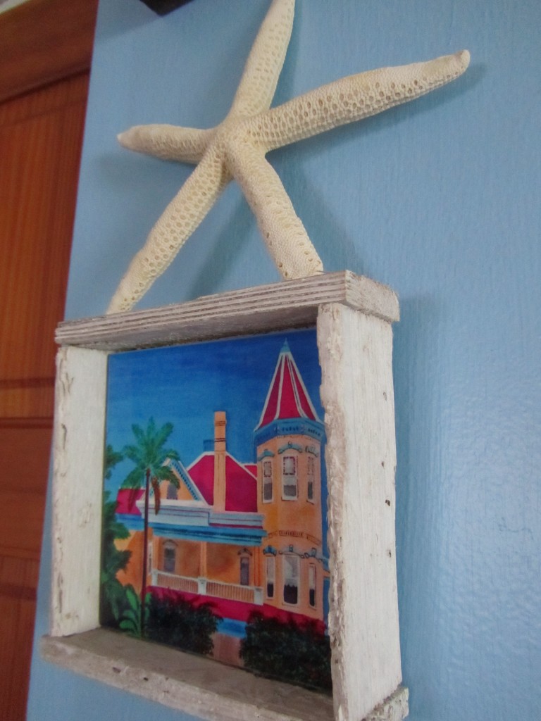
The new beach-themed kitchen was also a great reason to break out an old wedding gift — painted tiles featuring Key West scenes, surrounded by old lobster traps frames.
A friend bought us three of the traps as a wedding present, and on our last trip, we added one more — Southernmost House, which is where we got married!
Thankfully the kitchen isn’t bigger because I’m afraid I would go overboard in tchotkes. But I still found places to put some fun stuff.
No, sadly, the Syracuse pennant is not part of the decor. It was in E’s playroom, which is on the other side of the wall, when I took the picture. Even having a whole room just for toys to herself isn’t enough to contain all her stuff.
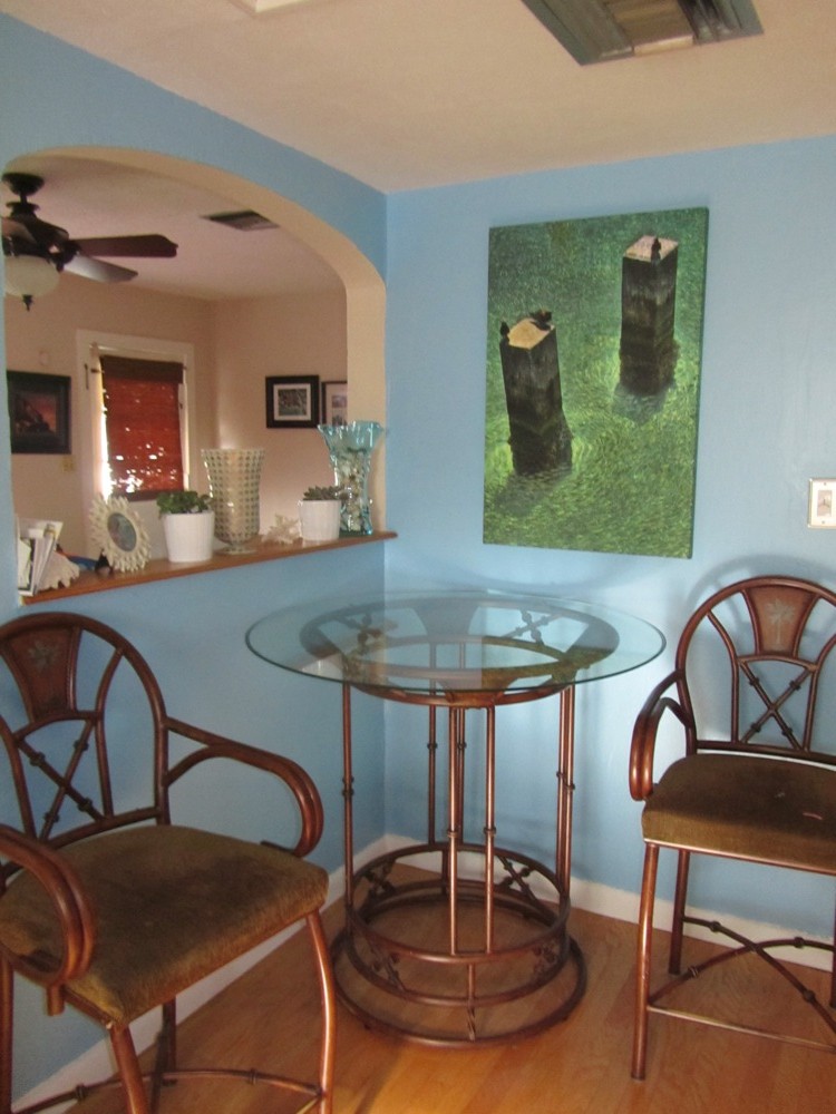
The kitchen was done for several months but there was one big thing missing — a piece of art for the big wall in the room. We decided to find something on our fifth-anniversary trip to Key West last summer. We figured what would be better than finding a beach-themed item in our favorite place.
Famous last words.
It was a bit like the Bataan death march. OK, I guess that’s insensitive, but it nearly ruined our trip. We went to SO many galleries and shops and could not agree on anything. We tend to be drawn to photos but I had put a moratorium on more photos because I sometimes feel our house is one big photo gallery. But most paintings, at least the ones in our price range, just always look cheesy to me.
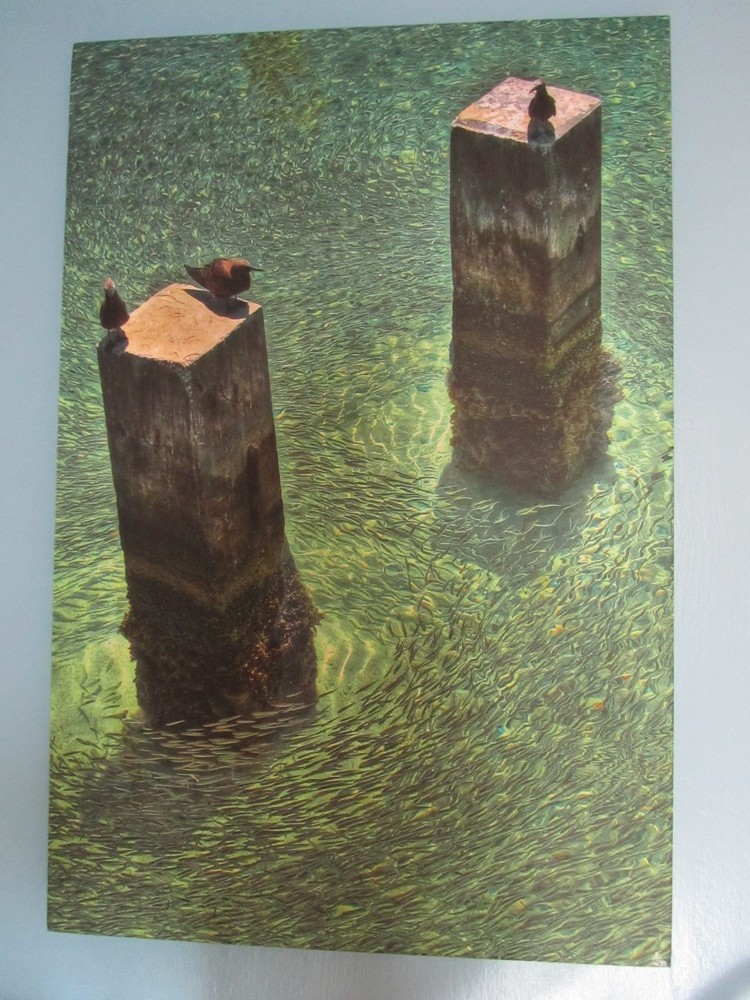
Finally, toward the end of our week, we found something. And it was a compromise. It was still a photo but the artist had manipulated it with different shutter speeds and combining a couple of photos so that it actually looks like a painting. Pus, it’s printed on canvas, so that helps, too. And the fact that we loved it didn’t hurt either.
In case you can’t tell, those are thousands of little fishies circling the cement posts. The picture is called “Three Little Birds” (perfect for our family of three) and photographer Justin Donoghue took it at Fort Jefferson in the Dry Tortugas, where DadJovi and I snorkled on our very first trip to Key West way back in 2003. So, you could say the picture has all sorts of special meanings for us.
It’s not really showing up in my photos, but it has these really beautiful flecks of blue that go so well with the walls.
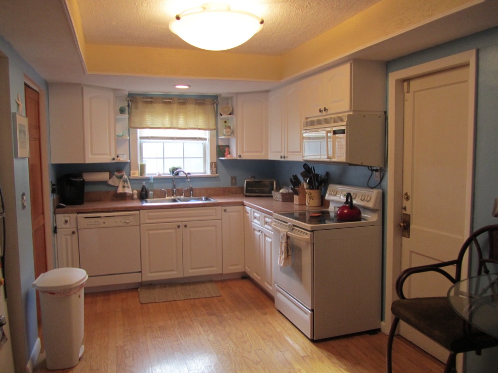
So, that, my friends, is my beach kitchen.
It’s not fancy and someday (but hopefully no time soon — we’ve hit our yearly limit on major home purchases!), we’ll get some new appliances. I also have a pipe dream of installing L-shaped cabinets and counters in the spot where the high-top table is now. There’s just no counter space or much storage in the kitchen right now. But the kitchen is certainly 1,000 times better than it was before this project and it still makes me happy whenever I’m in. Especially when I’m burning a coconut candle and there are daiquiris. It’s almost like being at the beach. Almost.
Does your kitchen have a theme? What’s one house project you’ve been wanting to do or recently completed?

Your kitchen turned out really great! I love the cabinet knobs and how you incorporated lots of personal elements into the decor.
We built in 2007 and 70% of the house still has white walls. So painting is on the to do list.
Thanks Dina! It was definitely decorated by us and not a decorator!
I know the white wall issues well. We redid E’s bathroom last summer and I STILL haven’t picked a color for its walls. They’re still white and it’s driving me crazy! When we moved into our house in 2003, we did some major renovations, so we hired painters because we were doing updates to so many rooms. Adding a few rooms of painting was hardly noticeable to the big bill! But that at least kept me from living with white walls forever — I HAD to make a decision then. Of course, it’s nearly time to repaint already. Things are starting to get nicked.
The joys of home ownership never fail!
Awesome ideas! I love how the photo/ painting has so many meanings. To me, that’s the kind of decor that inspires!
Thanks Maegan! The photo was definitely worth the wait — and the many mini-fights in Key West! Buying art together (or any other big house purchase) is just never an easy process. Thankfully it doesn’t happen to often. I can’t imagine us ever looking for a new house. It’d be a 5-year ordeal! It’s a good thing we’re stuck here forever thanks to the housing market in Florida!
Thanks for the comment